")
")
As of today, another tab with a new functionality is available in the app to follow the Evolution of Long-Term Predictions made by our team throughout the pandemic.
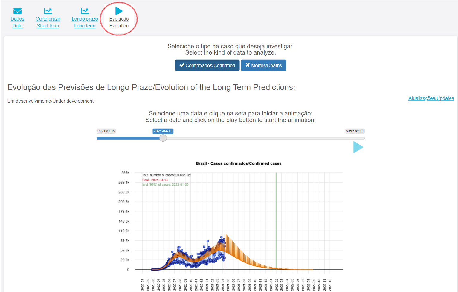
To view the animation, simply select the desired start date and click the play button. You can pause the animation at any time, as well as use the bar to select a specific date.
The graphs show the predictions that have been published weekly by our app, from the beginning of 2021 to the most recent forecast. The vertical red and green bars indicate the estimated credibility intervals for the peak and end of 99% of the cases, respectively. Point estimates for peak dates, end of 99% of cases, and also for the total number of cases or deaths, are highlighted in the legend in the upper left corner of the graphs.